One-page websites are great for telling about your business, beautifully designing your portfolio, or advertising an event: courses, webinar, master class or conference.
In the SitePro builder on our hosting, you can assemble a website piece by piece in a simple visual editor, even if you have never made a website before. In this step-by-step instructions we show you exactly how to do it.
What will happen in the end
Here is an example of a one-page website that we will create in this tutorial. You can view it in full at .

We chose barbershop as the theme for the one-page website, but our instructions are also suitable for other businesses. For example, for a tattoo studio, manicure salon, piercing or massage salon, vocal studio, courses and many other businesses.
A one-page website will have universal sections in its instructions: title banner, price list for services, gallery, reviews, contacts. You will learn how to create sections from scratch and, if necessary, you can add other blocks using the same principle. For example, a block with promotions or frequently asked questions.
In the future, if you need to expand the site and add additional pages, a store or a version in another language, this can also be done. You can read about this in other instructions on our website.
Beginning of work
After you order hosting, you will receive an email with the subject “Access to your builder and website.” It will contain a link to the site editor. Add this link to your browser favorites so you have a quick way to access the editor.
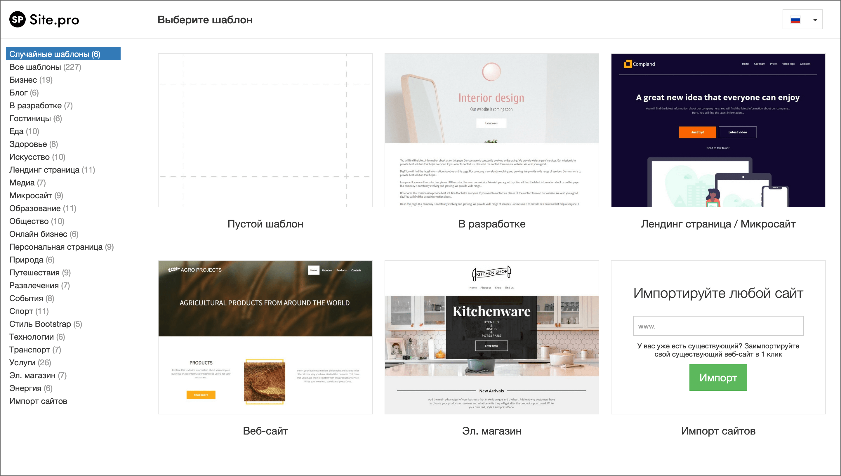
1. Select a template
When you go to the editor, you will be asked to select a one-page template. You can choose a ready-made website and simply replace its content with your own, but in this tutorial we will show you how to make a one-page website from scratch. Therefore, we select “Blank Template”.
Creating one-page websites from scratch is longer and a little more complicated than using ready-made templates, but this way you will better understand the principle of building pages. If you need to add something or redo a section in the future, it will be easier for you to do it.
2. Remember the main points about working with the constructor
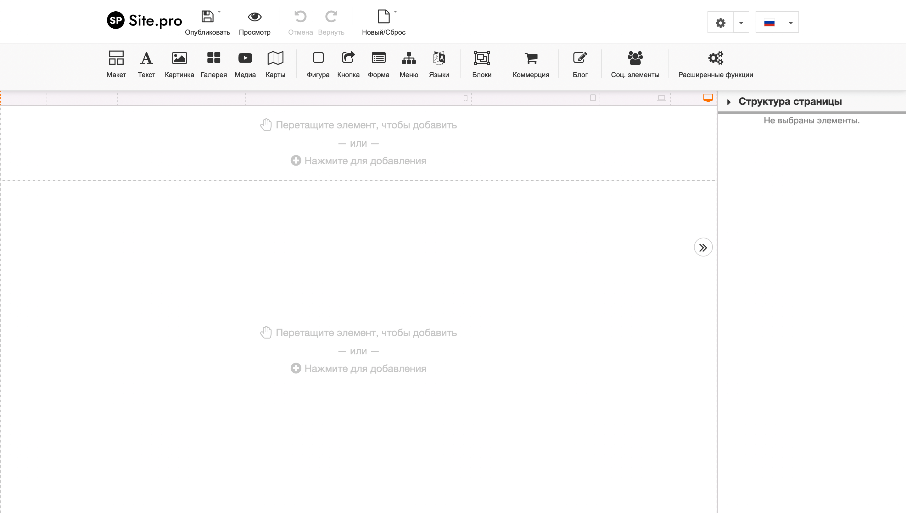
After selecting an empty template, the editor will open. In its header you will see blocks for creating a site, just below there will be an area with content where these blocks need to be dragged, and on the right there is a side panel where you can edit the parameters of the blocks.
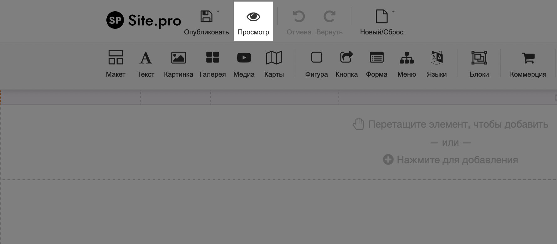
To check what a one-page page looks like before publishing, click the “Preview” button in the upper left corner of the designer.
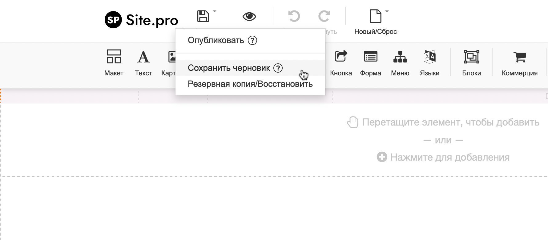
To save your progress, hover over the “Publish” button in the upper left corner of the builder, then select “Save Draft” from the drop-down list.
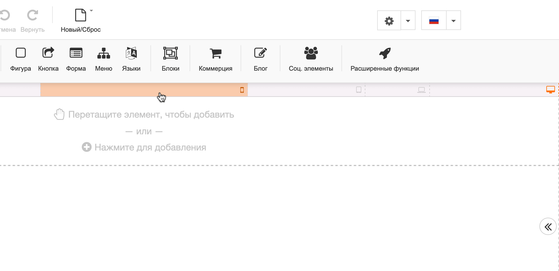
To enable site viewing from different devices, select the desired device in the line located between the designer header and the area for working with site content.
And finally, one more point –do not open the designer simultaneously in two tabs or from several devices, otherwise the changes may not be saved and everything will have to be done again.
3. Create text styles
We are talking about font, text size and other parameters. Standard styles probably won’t suit you. It’s easier to change all this right away, before moving on to creating a one-page page. This way you won’t have to be distracted by this during the instructions, you’ll just immediately select the desired style and that’s it.
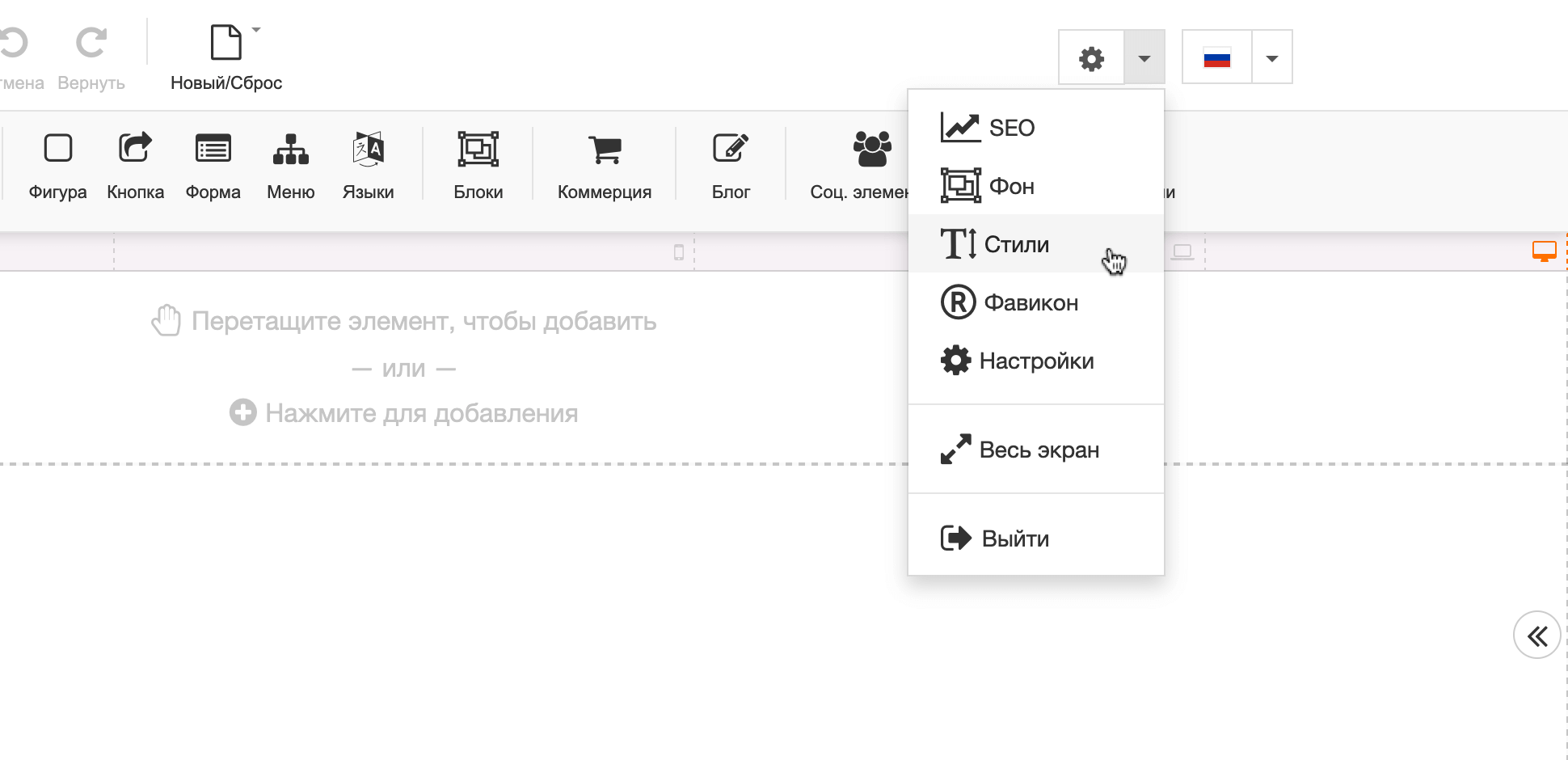
This is done in the site settings. In the upper right corner of the designer, click on the gear icon and go to the “Styles” section.
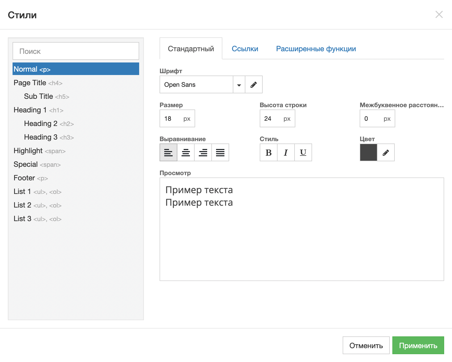
In the window that opens, all the styles that are currently in the designer will be listed on the left, and on the right there will be three tabs with the settings of the selected style.
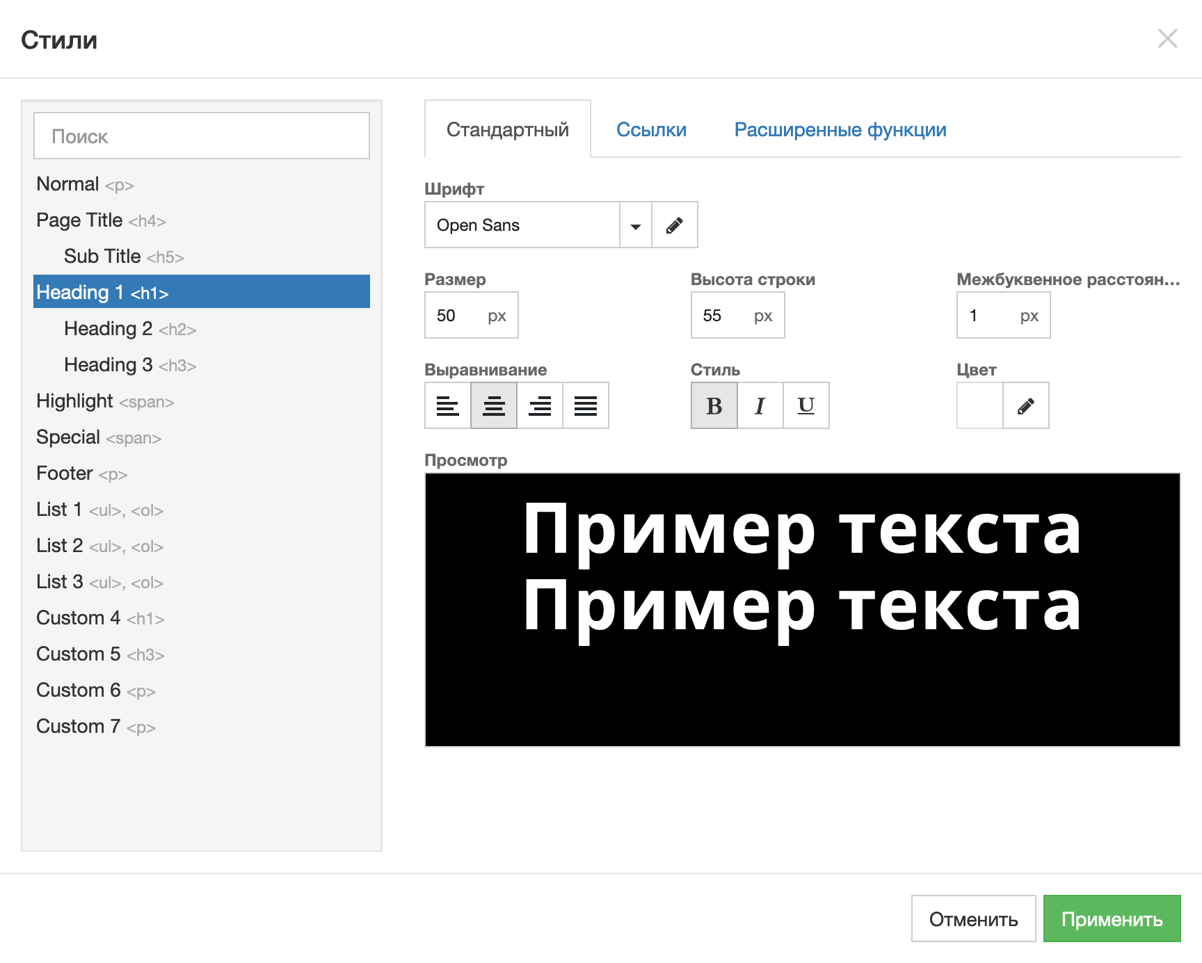
- On the “Standard” tab, all the most important things change: the font, text size and color. As well as line height, letter spacing and alignment. The result will be visible immediately – in the “View” window just below.
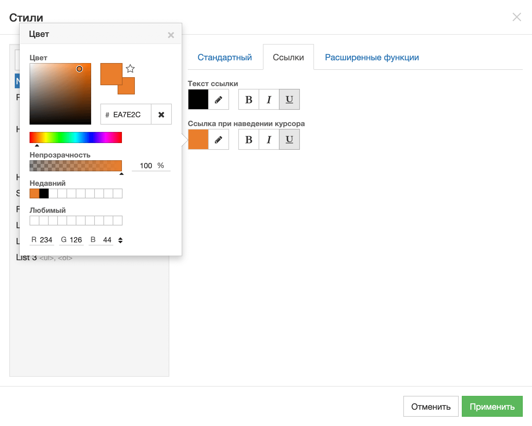
- The “Links” tab changes the appearance of links designed in the selected style. Here you can choose what color they should be by default and on hover, and also add an underline.
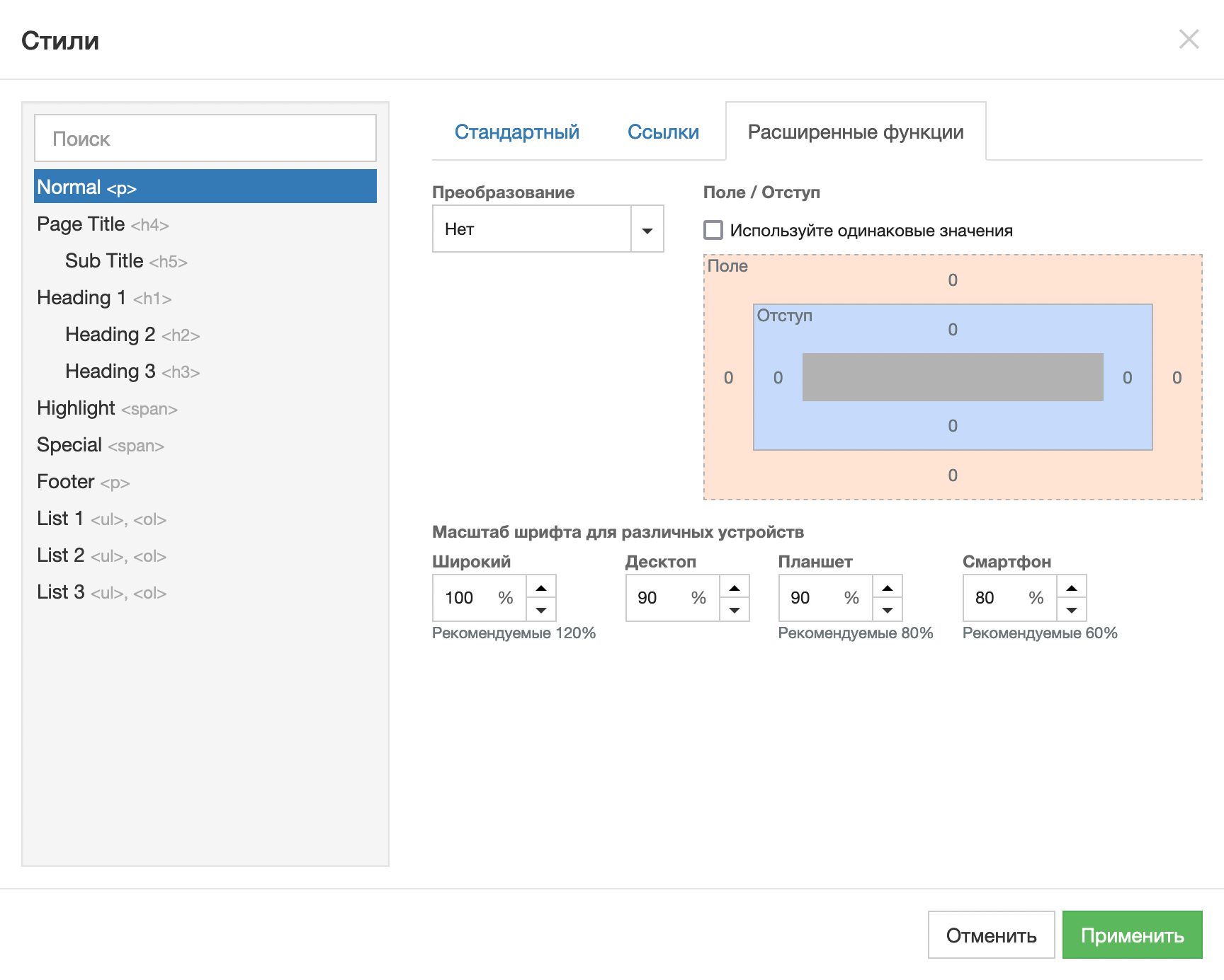
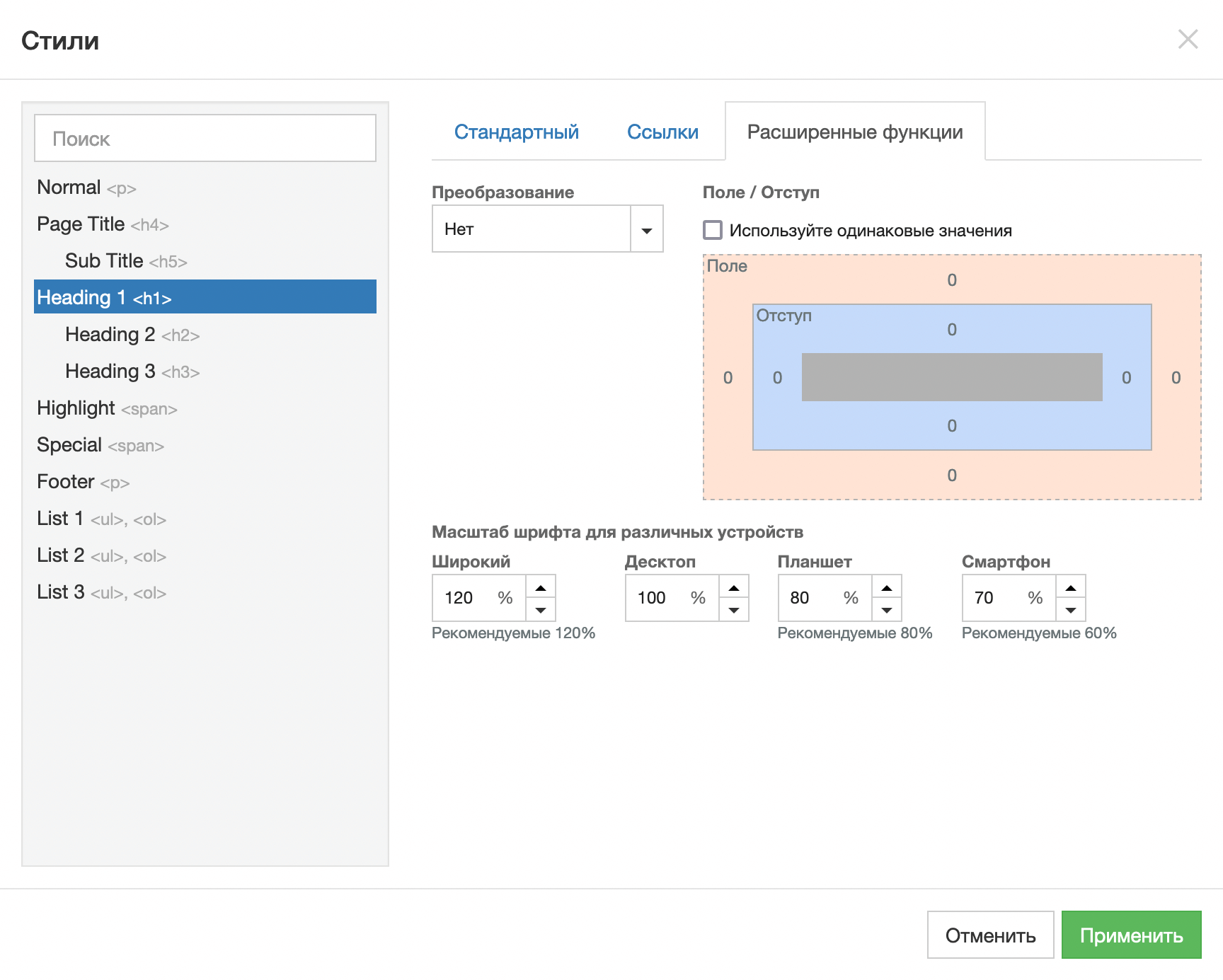
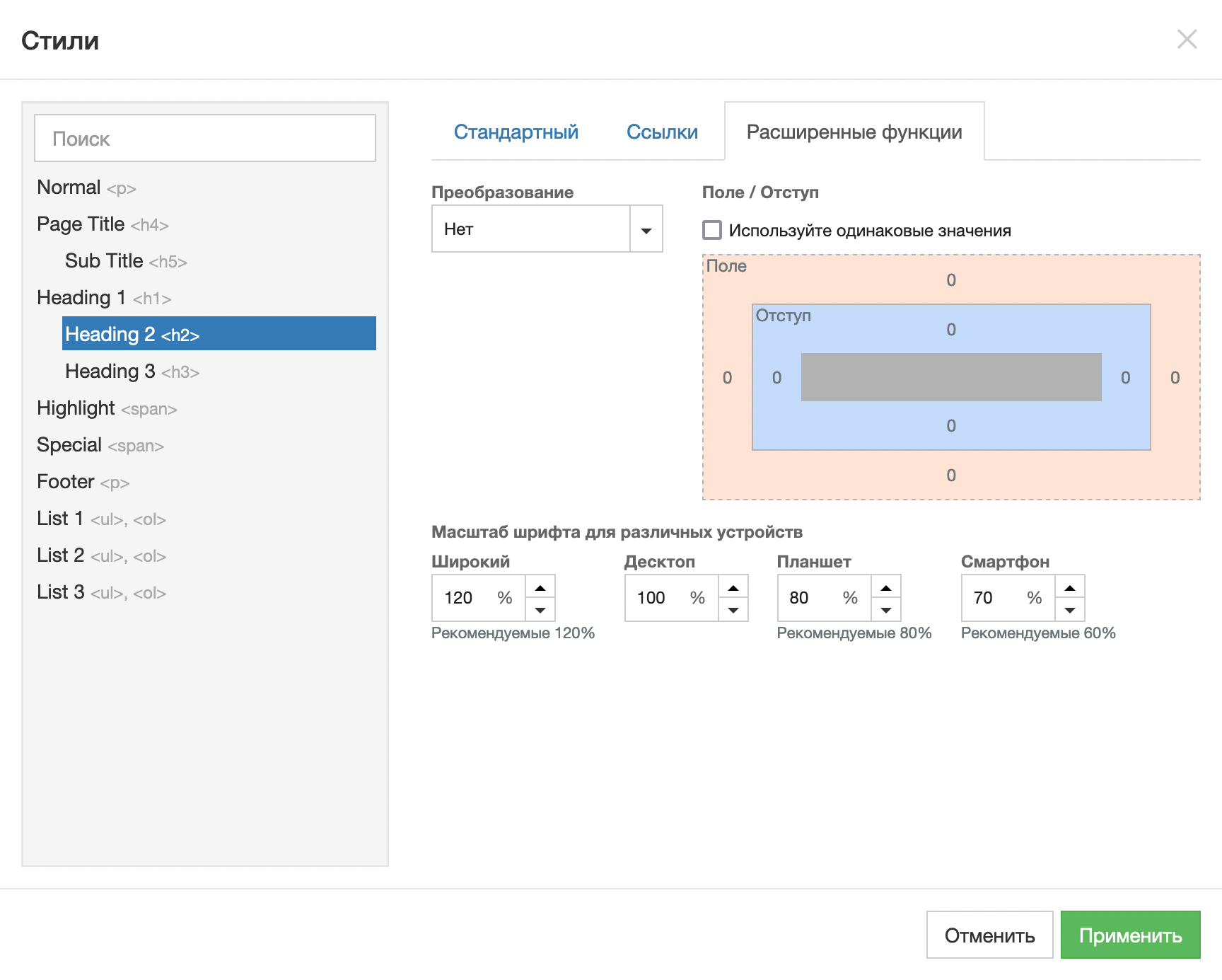
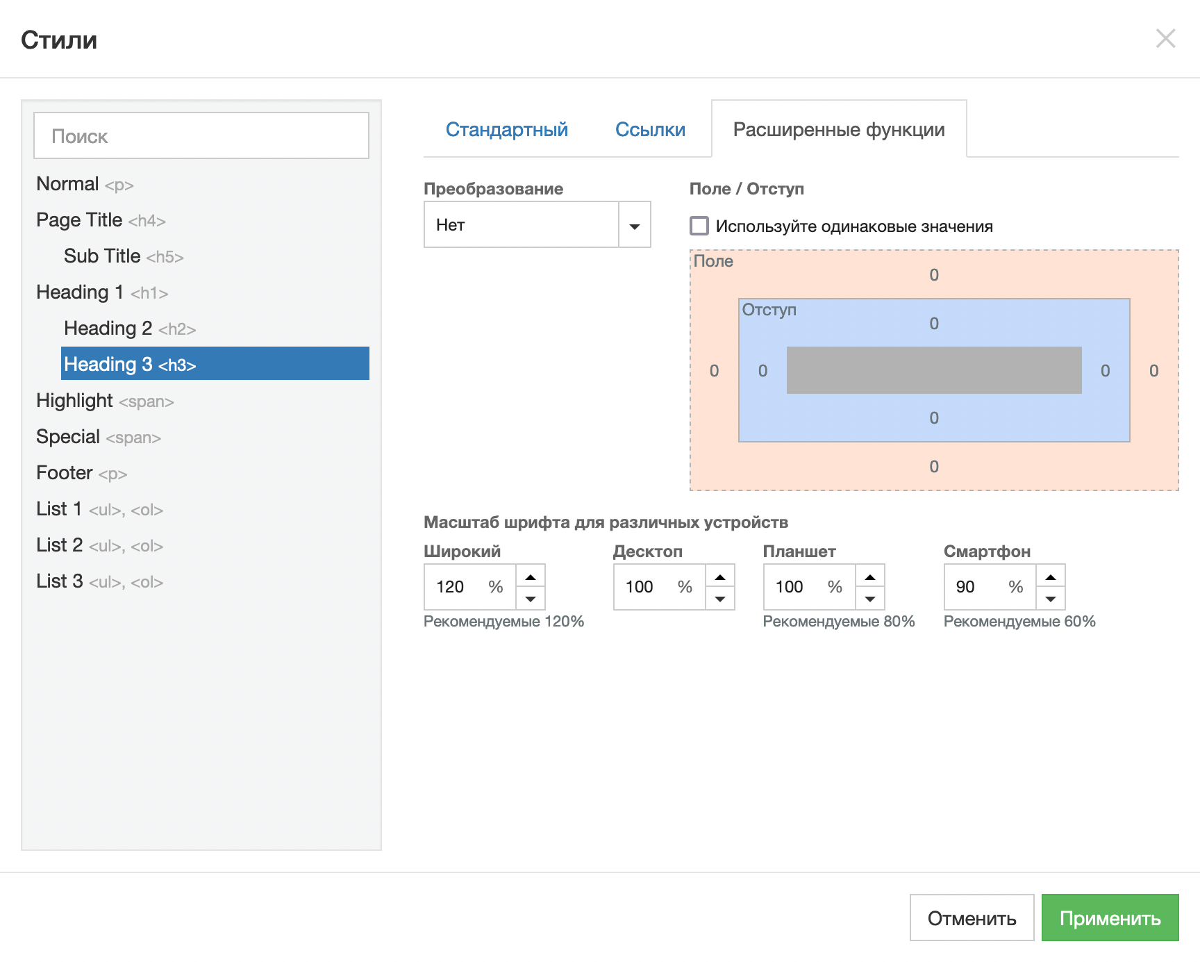
- The Advanced Features tab allows you to change the text transformation and scale. You can make all letters capitalize, and also choose what percentage of the main size the text should occupy on computers, tablets and smartphones.
Although the menu on the left has many styles, in practice only four of them are usually used: plain text and the first three levels of headings. We’ll show you what parameters we used for these styles, in case you want to use the same ones. Edit the remaining styles yourself if necessary.
Plain text. Will be used most often on the site. Here are the values we used for this style on the demo site.
H1 Headings. Use this heading only once on the page—to form the title page. This is better from an SEO point of view.
We used white because the title banner is dark. We didn’t change the settings on the “Styles” tab, because they usually don’t put links in titles.
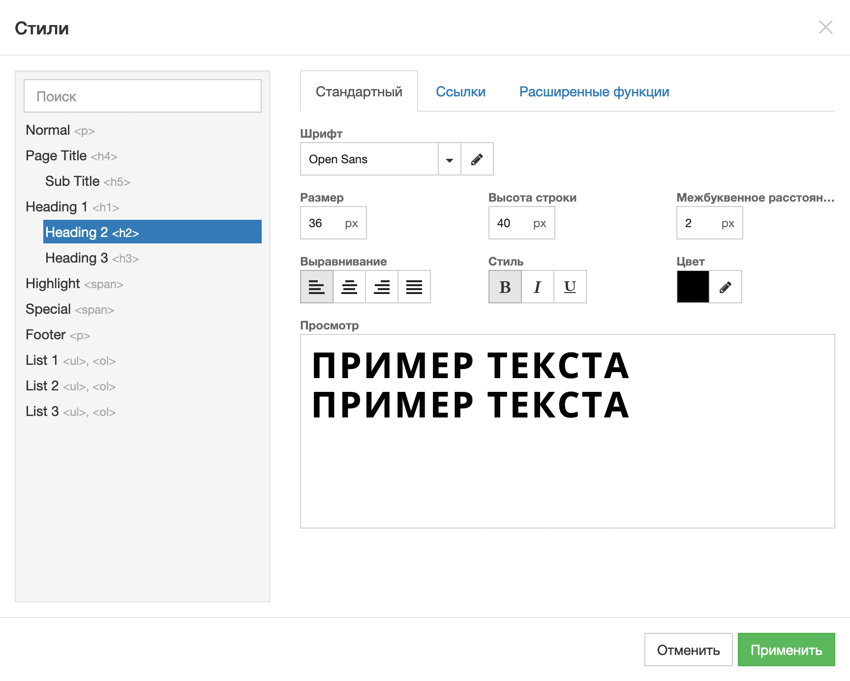
H2 Headings . This style is good for section headings. It’s not as big as the H1, but it still looks solid.
H3 Headings . This style is suitable for subheadings in columns. Larger than regular text, but almost half the size of an H2 heading (will not draw attention away from it).
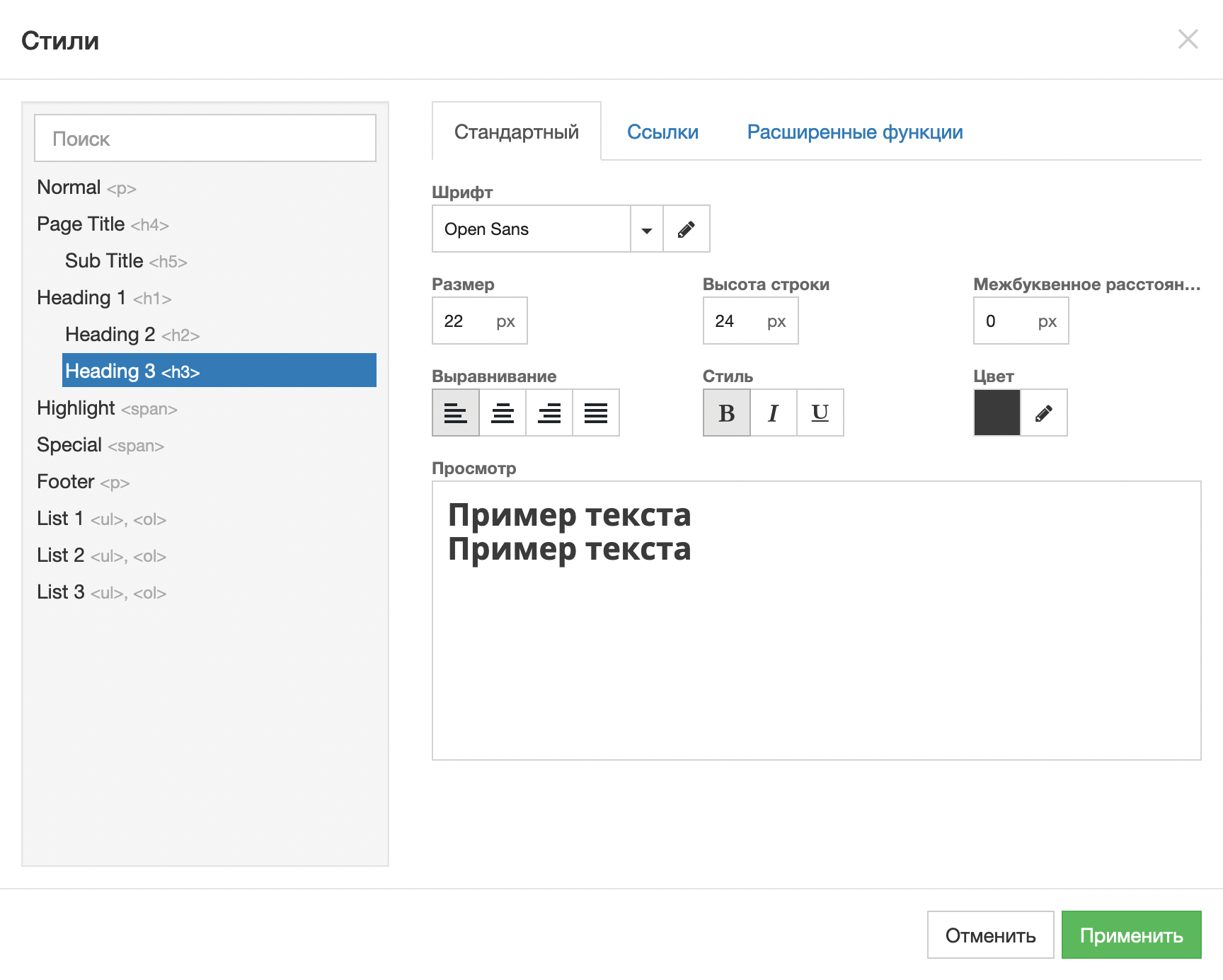
After changing the text style settings, be sure to click the Apply button.
This completes the preparation for work. We’ve created the styles for the text, it’s time to create a one-page page 🙂
Section No. 1. Title banner
The title banner is the first thing a person will see when they visit the site. It usually contains an attractive image, title and description of the site. Perhaps also a logo and a button to scroll to the next section or the ability to place an order/make an appointment.

Step 1: Create a container
This is done using the Layout block. Drag it from the designer header to the area for working with the site, just below the area for the site header (its boundaries are marked with a dotted line). For convenience, the place where the block lands is highlighted in blue.
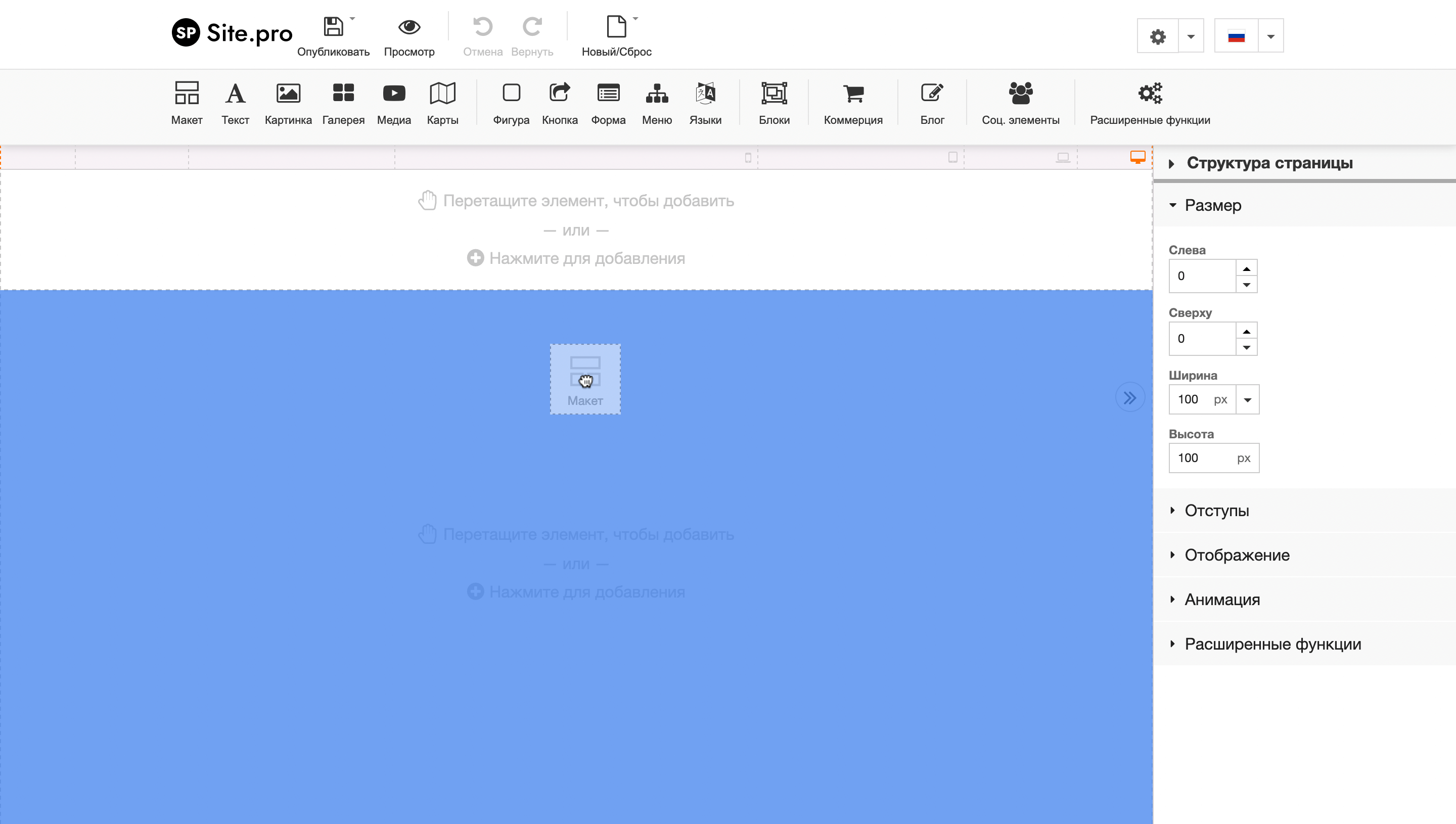
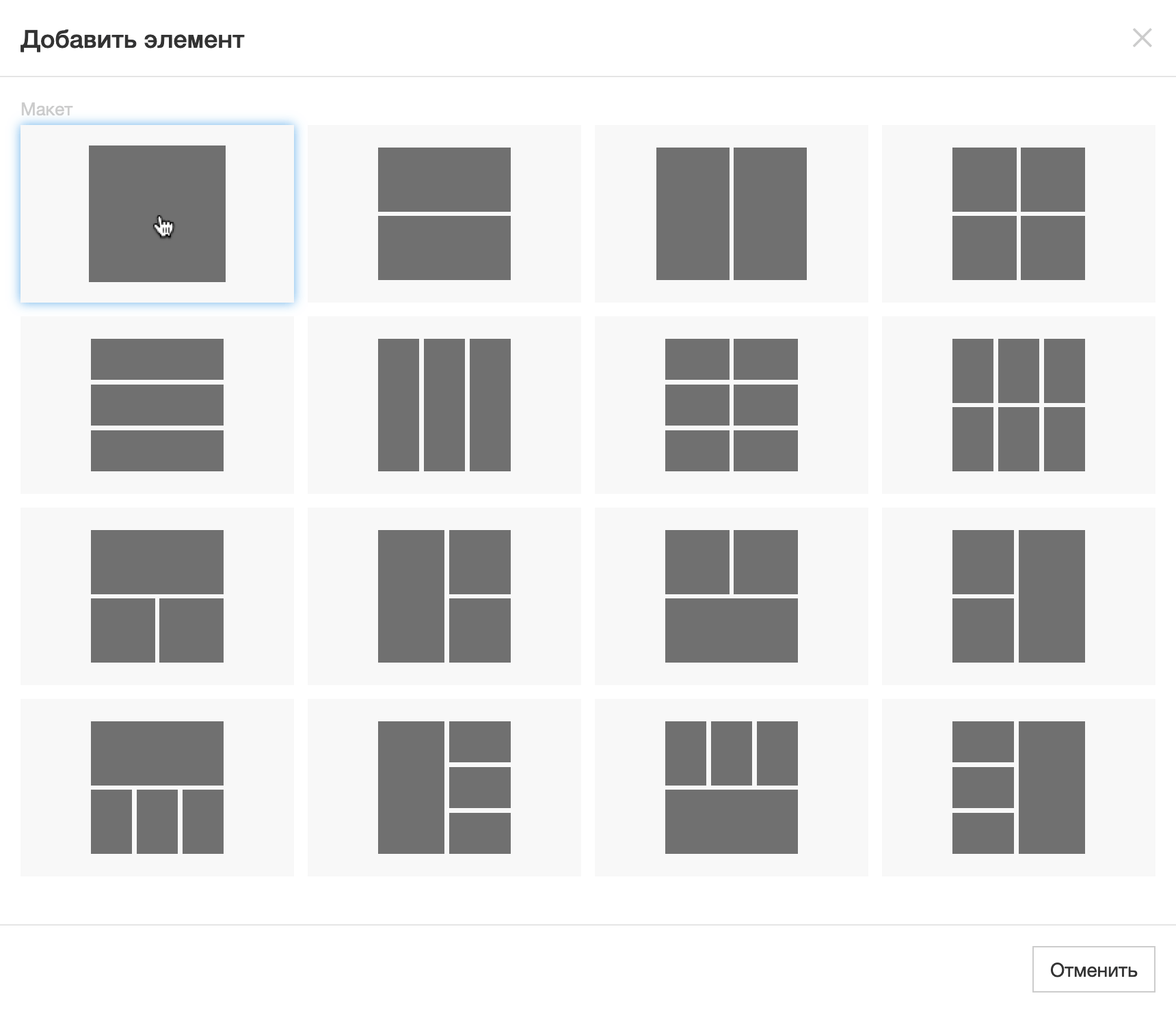
In the pop-up window that appears, select a single-column structure.
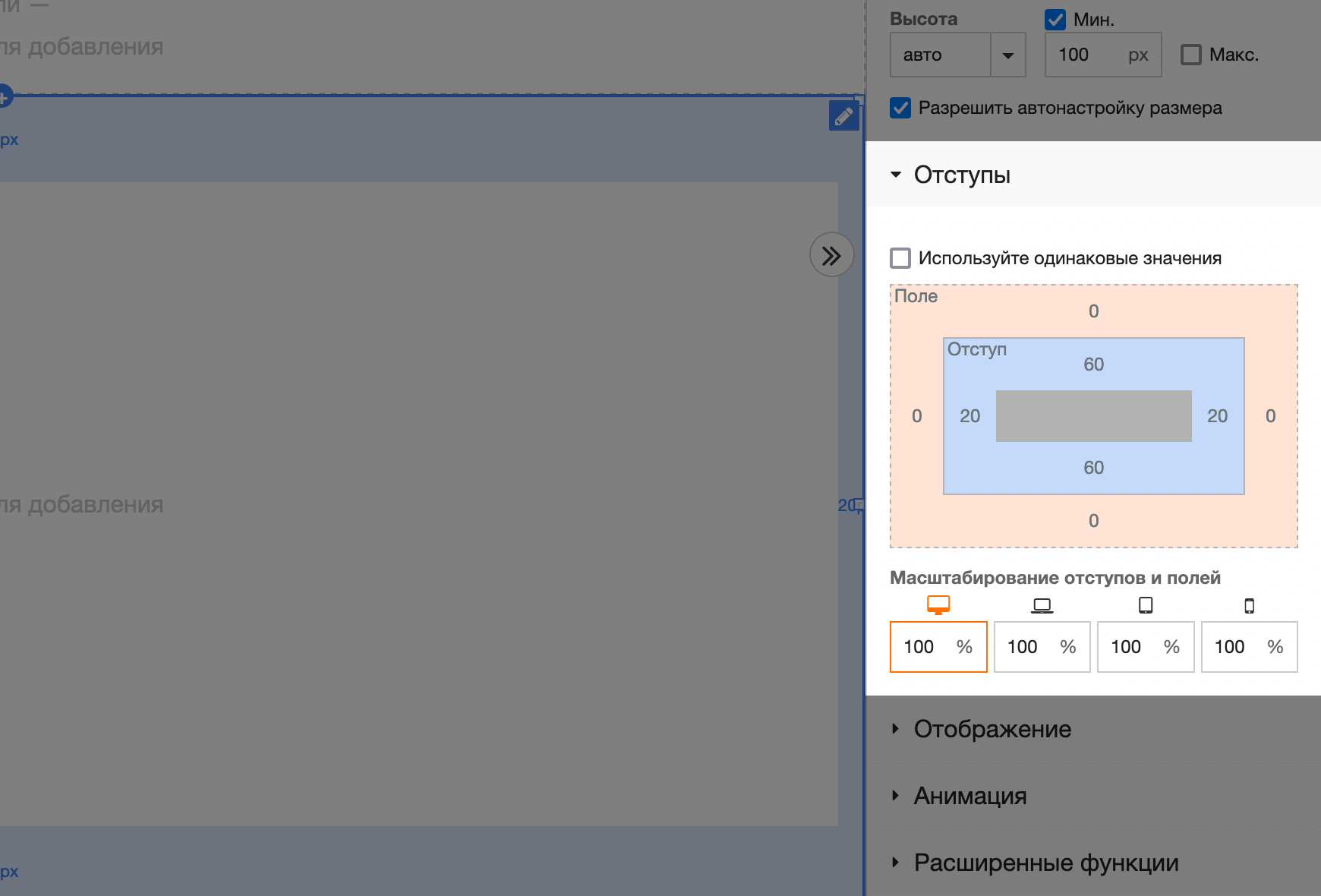
Immediately add padding inside the section. They are needed so that on smartphone screens the contents of sections do not stick to the borders of the screen or the borders of another section. Think of these indentations as the margins in a book—a small border for the sake of aesthetics.
Find the “Padding” section in the sidebar and replace the default values in the blue cells. You can use proven standard padding: 60 pixels on top and bottom, 20 pixels on the sides.
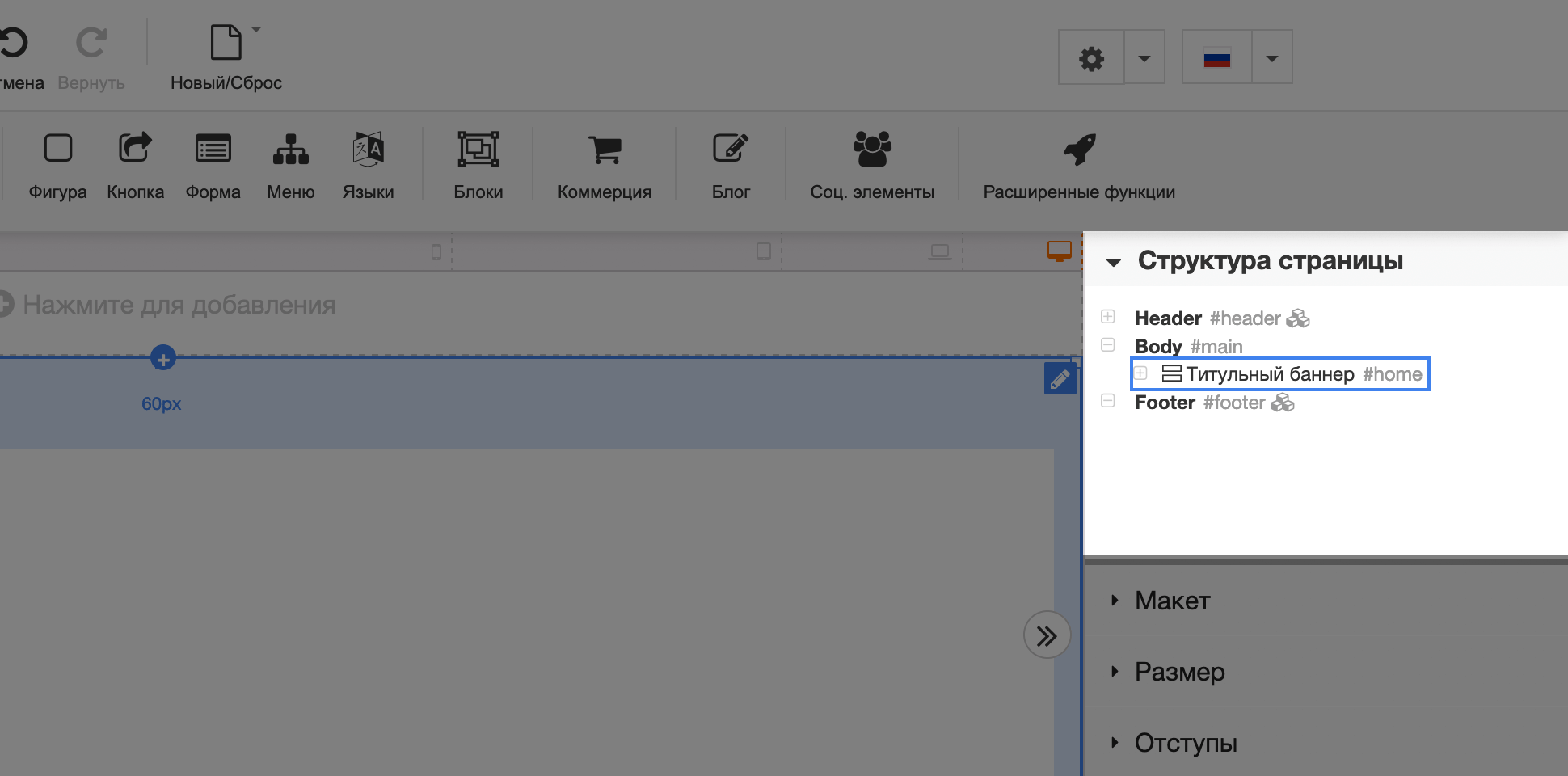
And the last nuance – add a title and anchor link for the section. This is also done in the sidebar, in the “Advanced Functions” section. In the “Anchor Name” option, enter “home”, and in the “Name” option, enter “Title Banner.” As in the screenshot below.
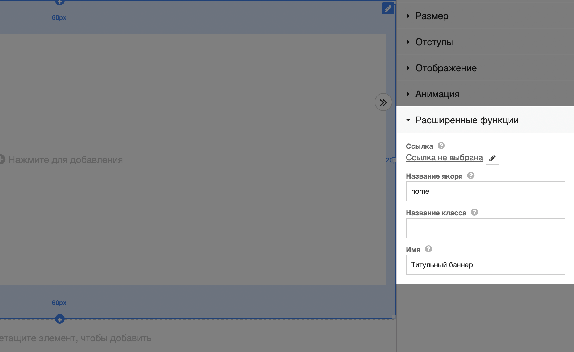
The name of the anchor is needed for the future menu in the site header – in order to bind the anchor to the “Home” button and the site visitor could return to the beginning of the one-page page by clicking on this button.
The section name is needed for order. Notice the Page Structure section at the top of the sidebar. When you expand it, you will see all the elements on your site in their hierarchy. There’s almost nothing here for now, but there will be dozens of lines at the end of the instructions. The section name will help you avoid confusion and make it easier to find a specific block in a specific section in the future.
Step 2: Add an Image
The title image could be a photo of your workplace, you at work, or a beautiful composition of your work accessories. Remember that this photo is the first thing a visitor will see. It’s not a sin to even hire a professional photographer for photos on the site.
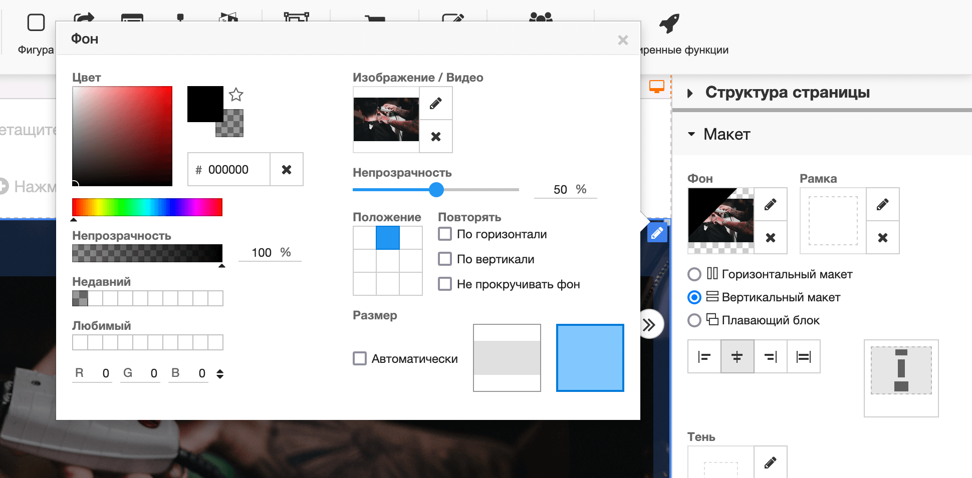
In the sidebar, find the “Layout” section and at the very top, click on the “Background” option.
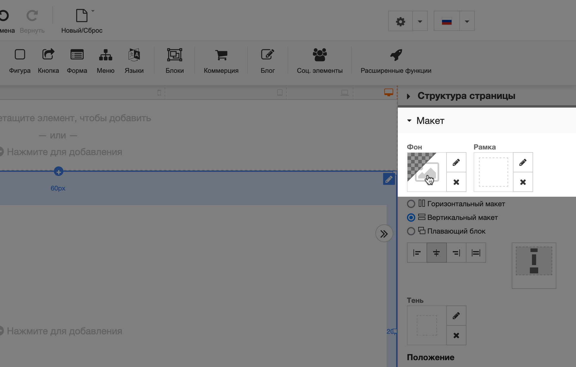
In the pop-up window that appears, click on the “Image/Video” option.
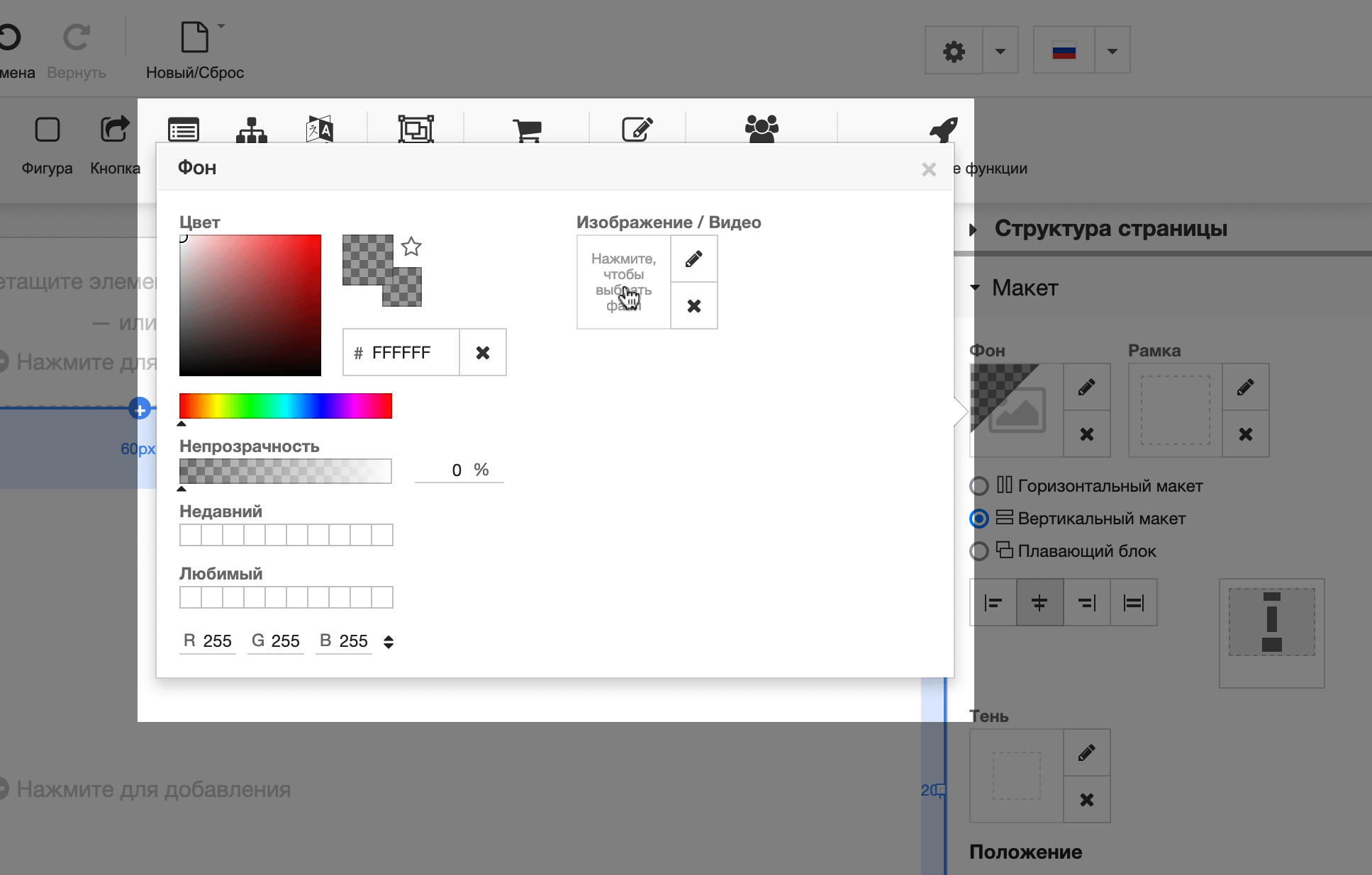
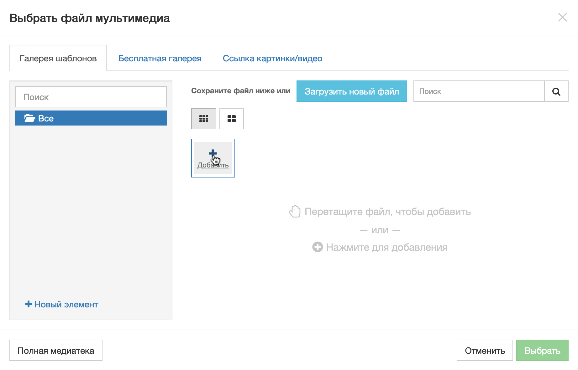
Another pop-up window will appear with an “Add” button. Click it and select the image on your computer. Then close the pop-up window by clicking on the “Select” button in the lower right corner.
The first popup will still be open. In it you can change the parameters of the image you just added:
- The Opacity option darkens the photo with a color that can be selected slightly to the left. This will increase the readability of the text that will be placed on top of the image.
- The Position option controls which part of the image is emphasized on small screens. The image will be cropped on them. To check how it will look, close the pop-up window and there will be a narrow strip between the builder header, where the blocks are located, and the area for the site header, where you can switch between versions of the site for different screens.
- The “Repeat” option makes the image begin to repeat along a given axis if its size is smaller than the screen size. If you check the “Do not scroll background” checkbox, an interesting effect will be added: when scrolling the site, the image will not move; instead, the content located below will appear to run over it.
- The Size option controls how much space the image should take up. In the drop-down lists, instead of the “auto” option, you can select the size in pixels or percentages. If you uncheck the “Automatic” option, two template size options will appear instead of drop-down lists: 1) fill the image to the height of the container; 2) fill the image to the width of the container.
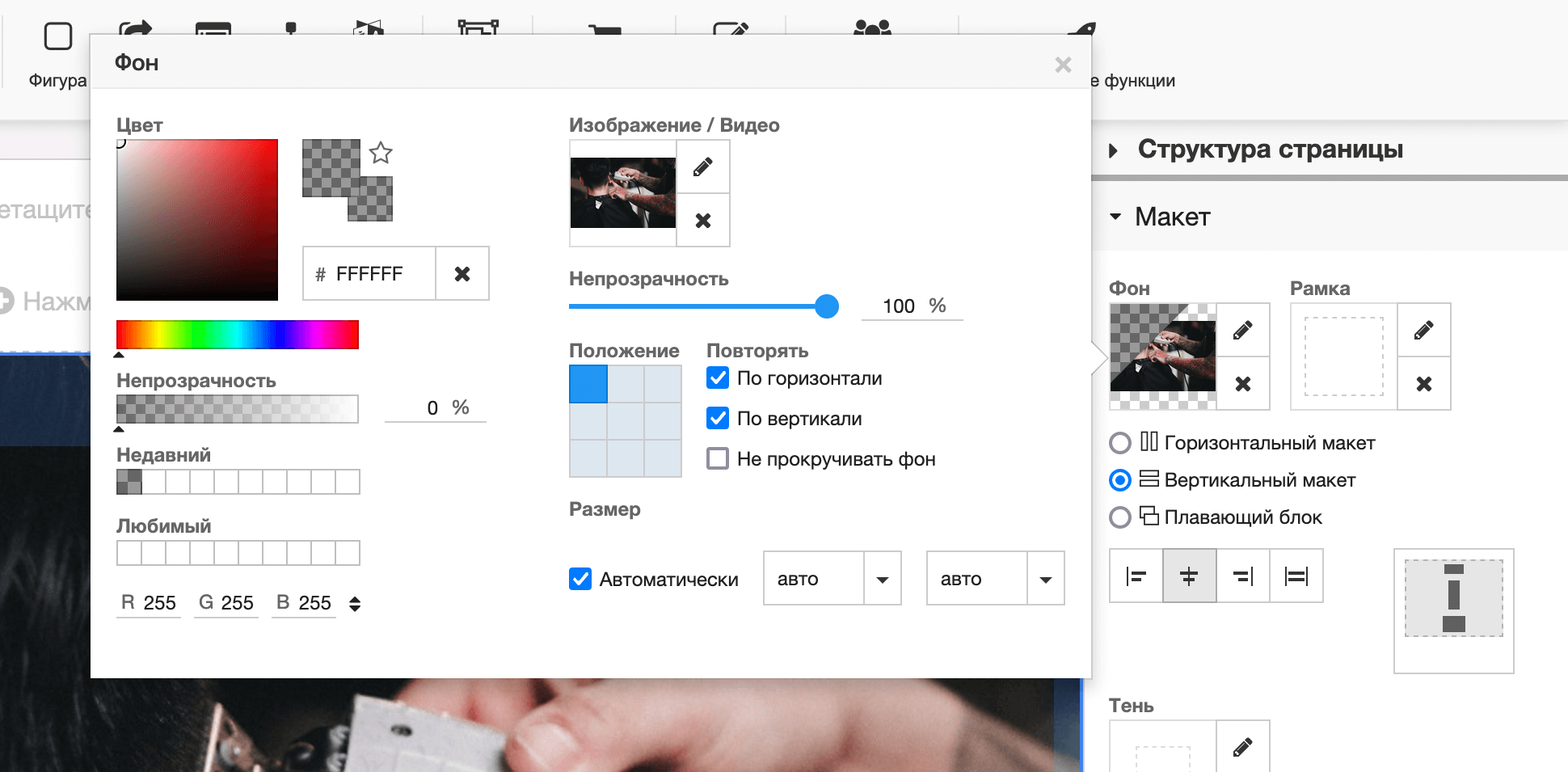
In the screenshot above, all parameters are indicated in “default” values. Here’s how we changed them for our demo site. Try our settings and see if you like how the image looks on different screens. Maybe in your case you will have to try slightly different parameters.